Crafting a Brand Identity and Checkout Experience for Sprout
Project Type
Brand Design & Web Design
Tools
Figma, Adobe Illustrator
Duration
4 weeks
Transforming a cozy vegan delivery service in Seoul with a fresh brand identity and smoother cart and checkout experiences.
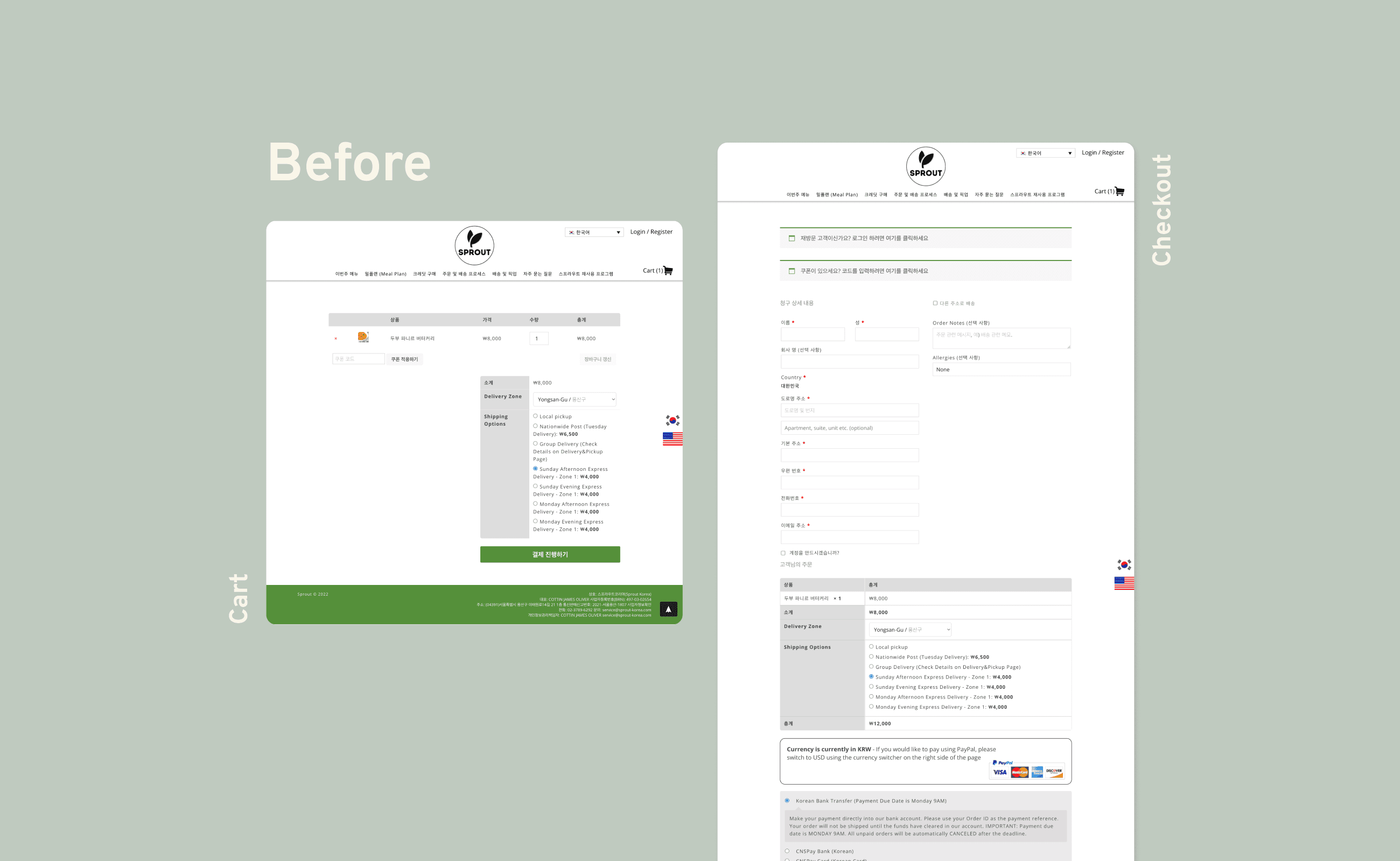
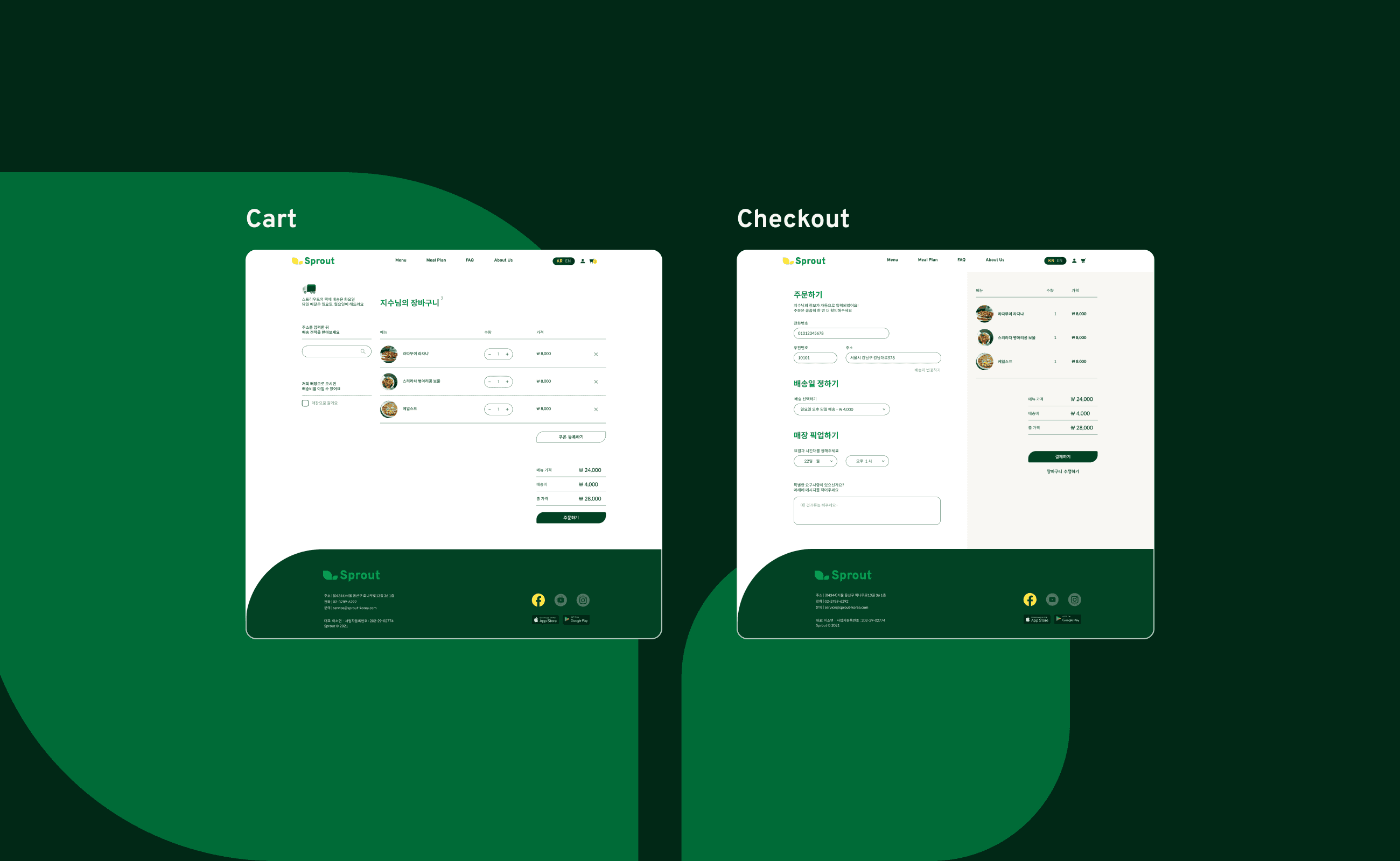
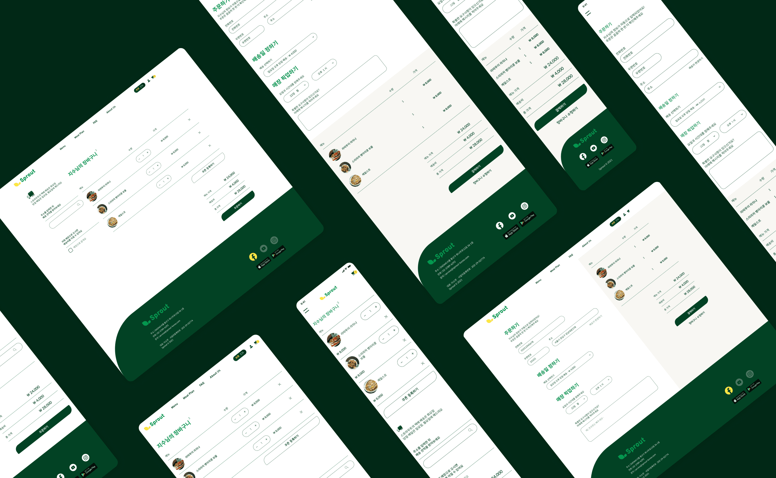
I took on the redesign of Sprout as a personal project, focusing on improving its brand identity and user experience. Using bold colors and keeping the original 'sprout' symbol in the logo, I made sure to stay true to the brand's values. Additionally, I updated the cart and checkout pages to make the buying process smoother, contributing to a better overall user experience.
Color & Typography: Sprout's Fresh Look
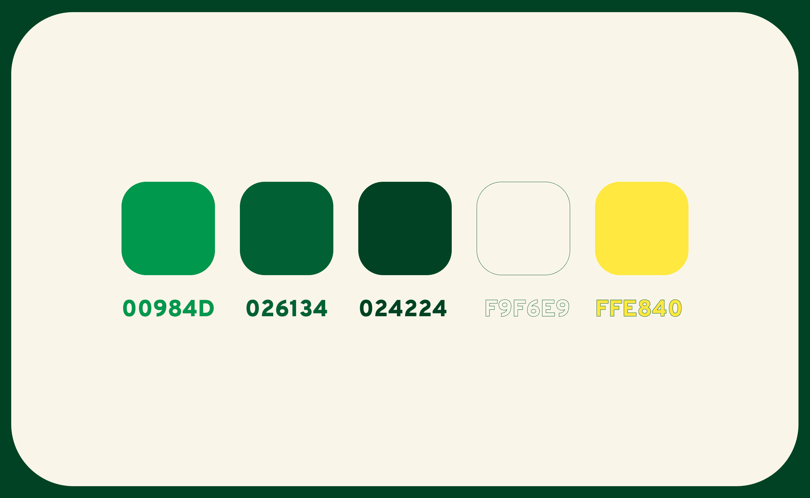
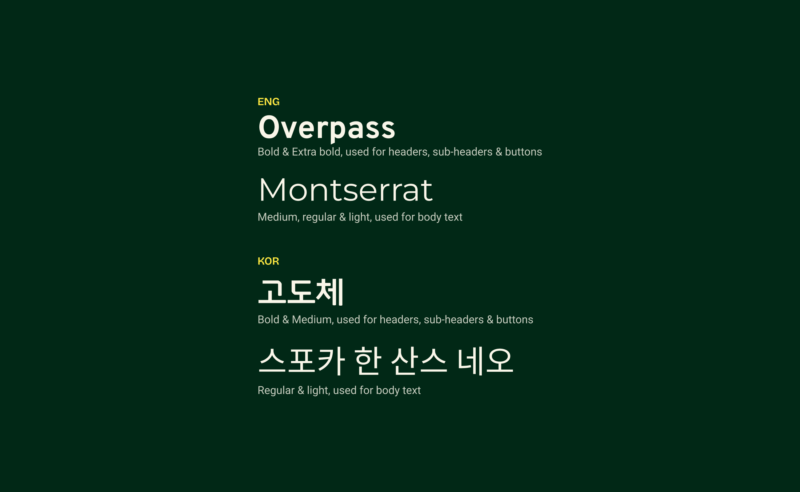
For Sprout's look, I started with bright colors like green and cheerful yellow to capture its fresh vibe. I made sure all colors were easy to see by testing them for contrast. For fonts, I chose ones with a lively style that works in both English and Korean, keeping the brand's spirit alive.
Leaf-Inspired Buttons and Round Icons
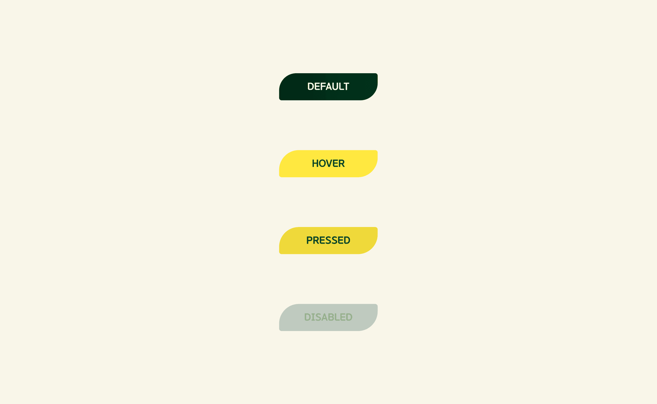
I implemented key colors for each button state to maintain brand identity consistency. Additionally, I designed round icons and leaf-shaped buttons to resonate with Sprout's aesthetic.
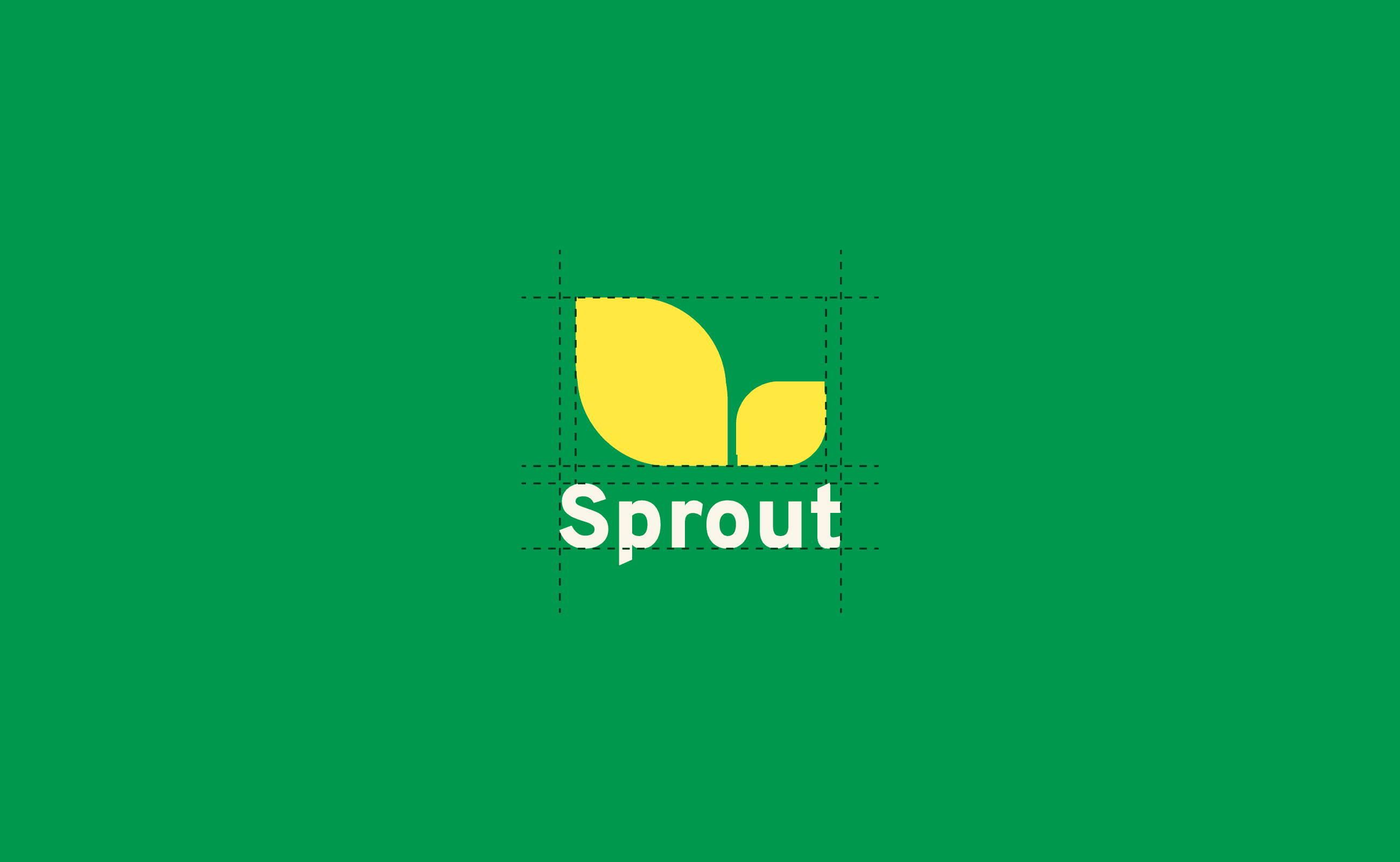
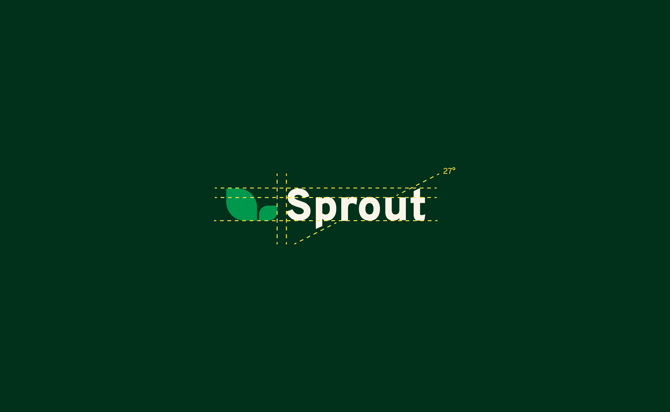
Introducing Sprout's New Logo Design!
I redesigned Sprout's logo, keeping the leaf motif to stay true to the brand. The new design is fresh and colorful, perfect for attracting a younger audience. The logo comes in 3 versions: horizontal, vertical, and icon.
