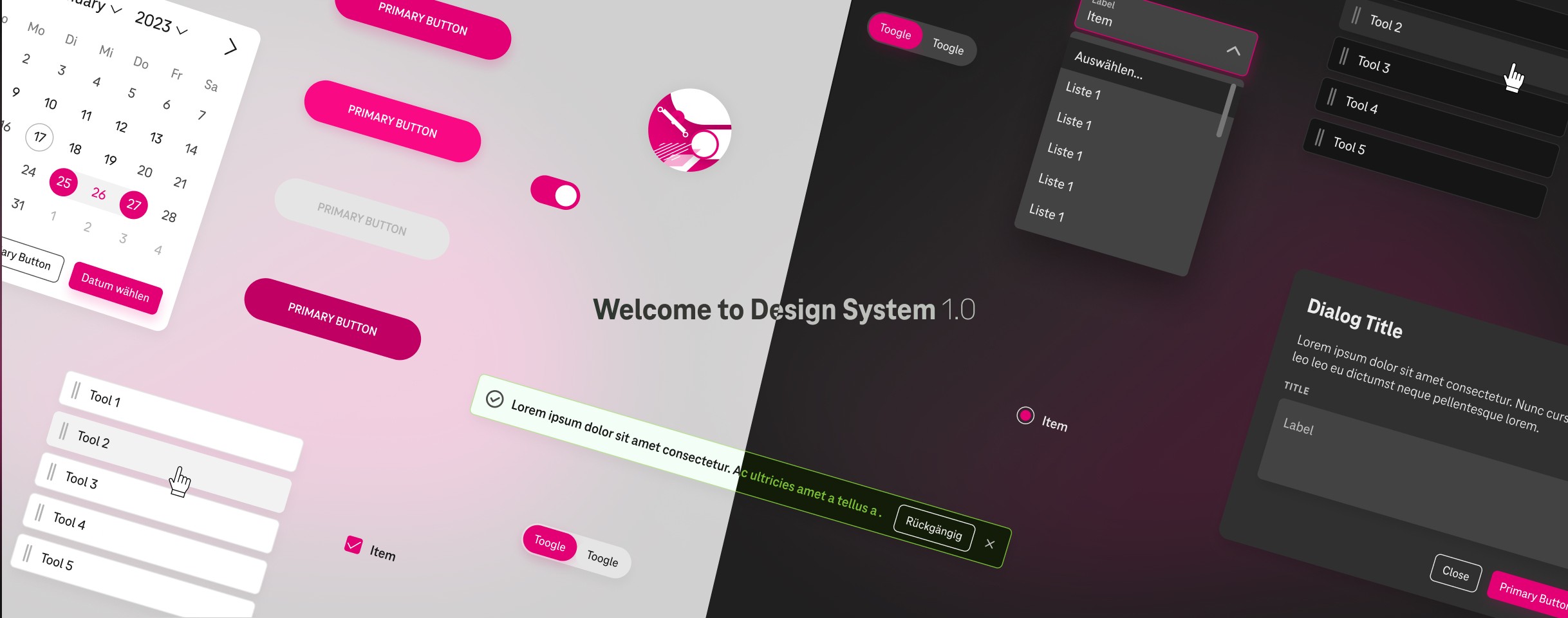
Welcome to Design System 1.0.

Project Type

UX/UI design

Tools

Figma, Miro, Jira, Confluence

Duration

4 months

Main Project Image
Main Project Image
Main Project Image

A design system to build a user-friendly digital hub empowering 50,000+ employees

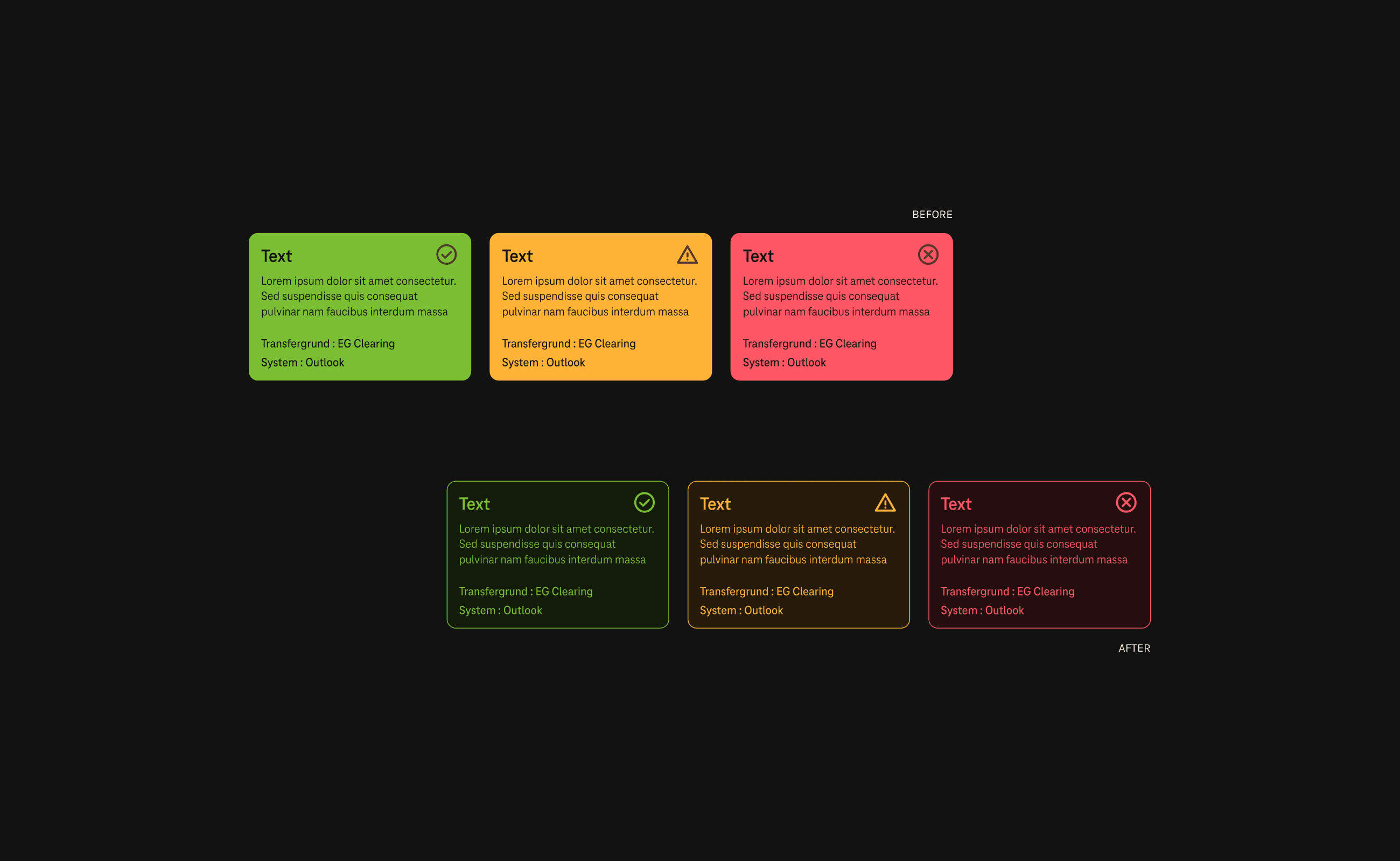
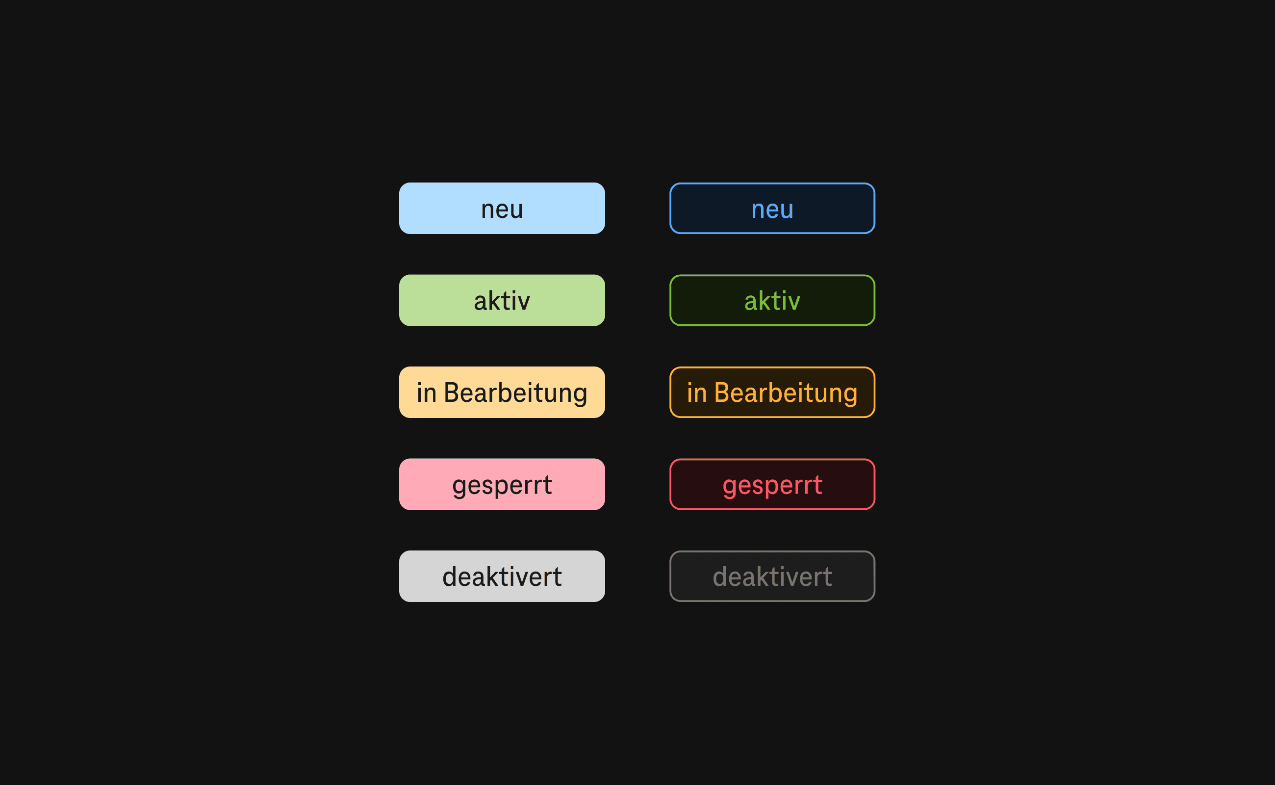
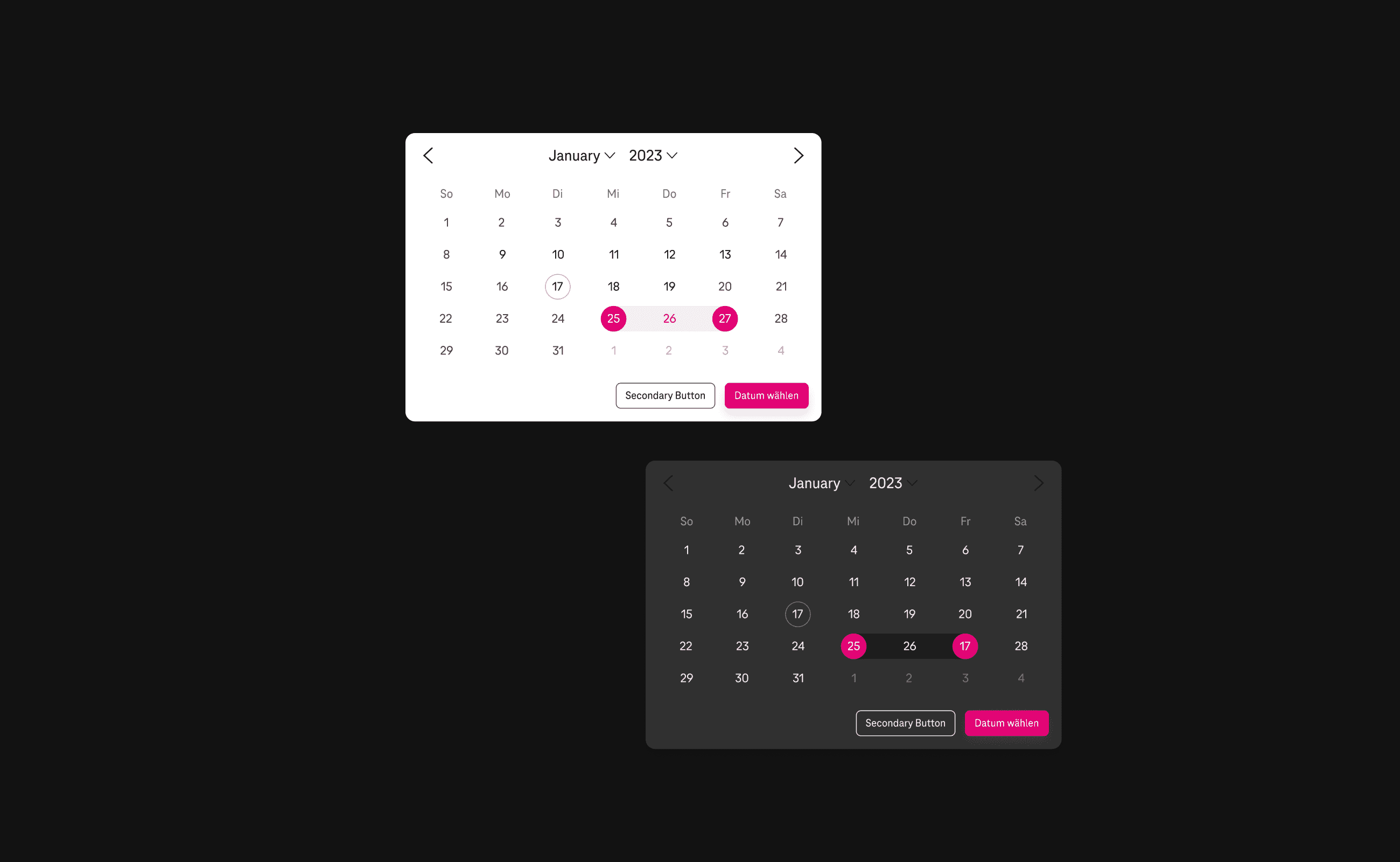
It was our client's wish to restructure their design system. As part of the team, I rebuilt and refined UI elements and documented the design system guide. The design system offers both Light Mode and Dark Mode themes allowing users to choose their preference. Dark Mode makes the system more accessible for the visually impaired. Beyond this, there are many other benefits to having both themes from reducing eye strain to increasing battery life.

Large Project Gallery Image #1
Large Project Gallery Image #2

Guide For Colours: Contrast and Accessibility

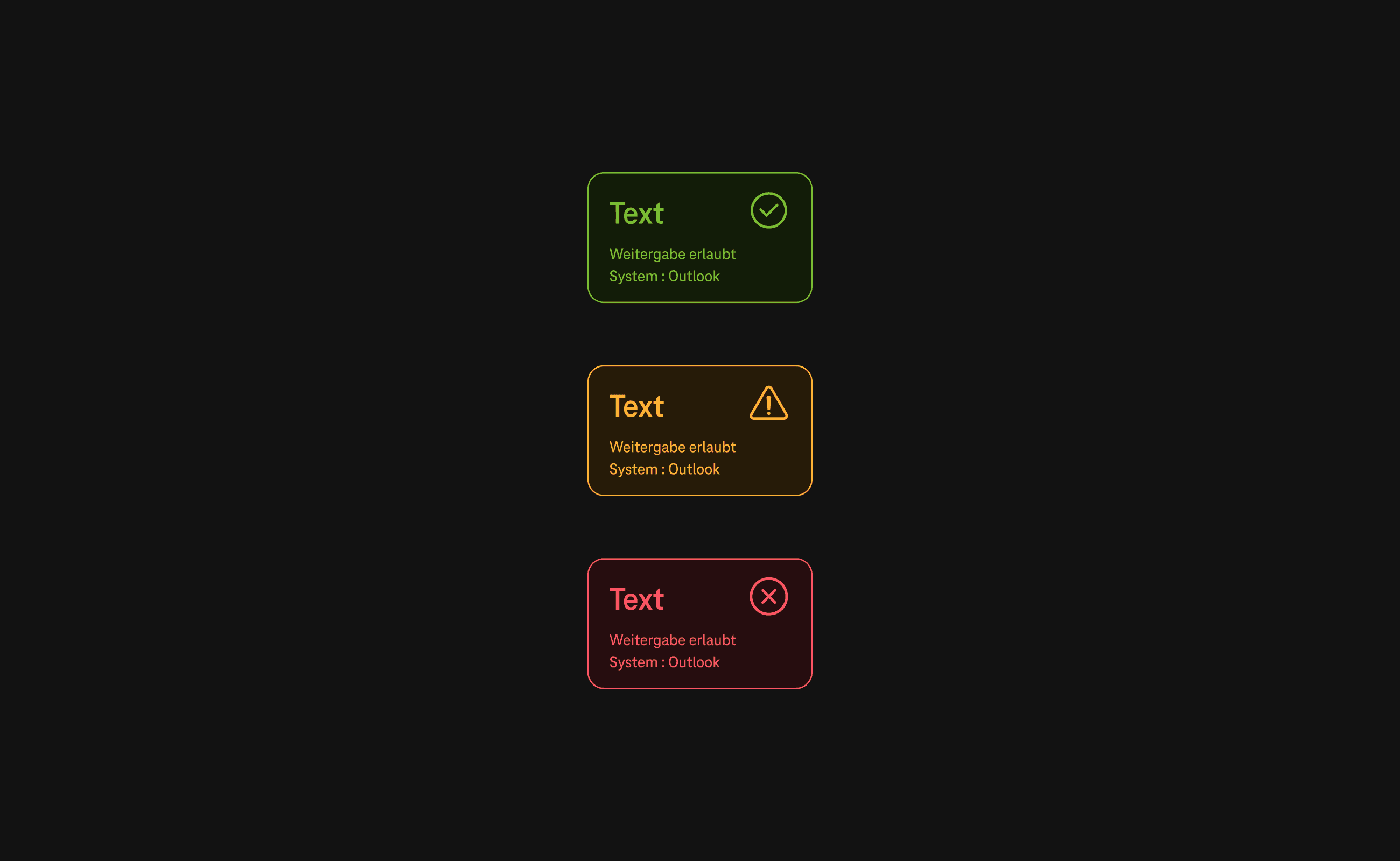
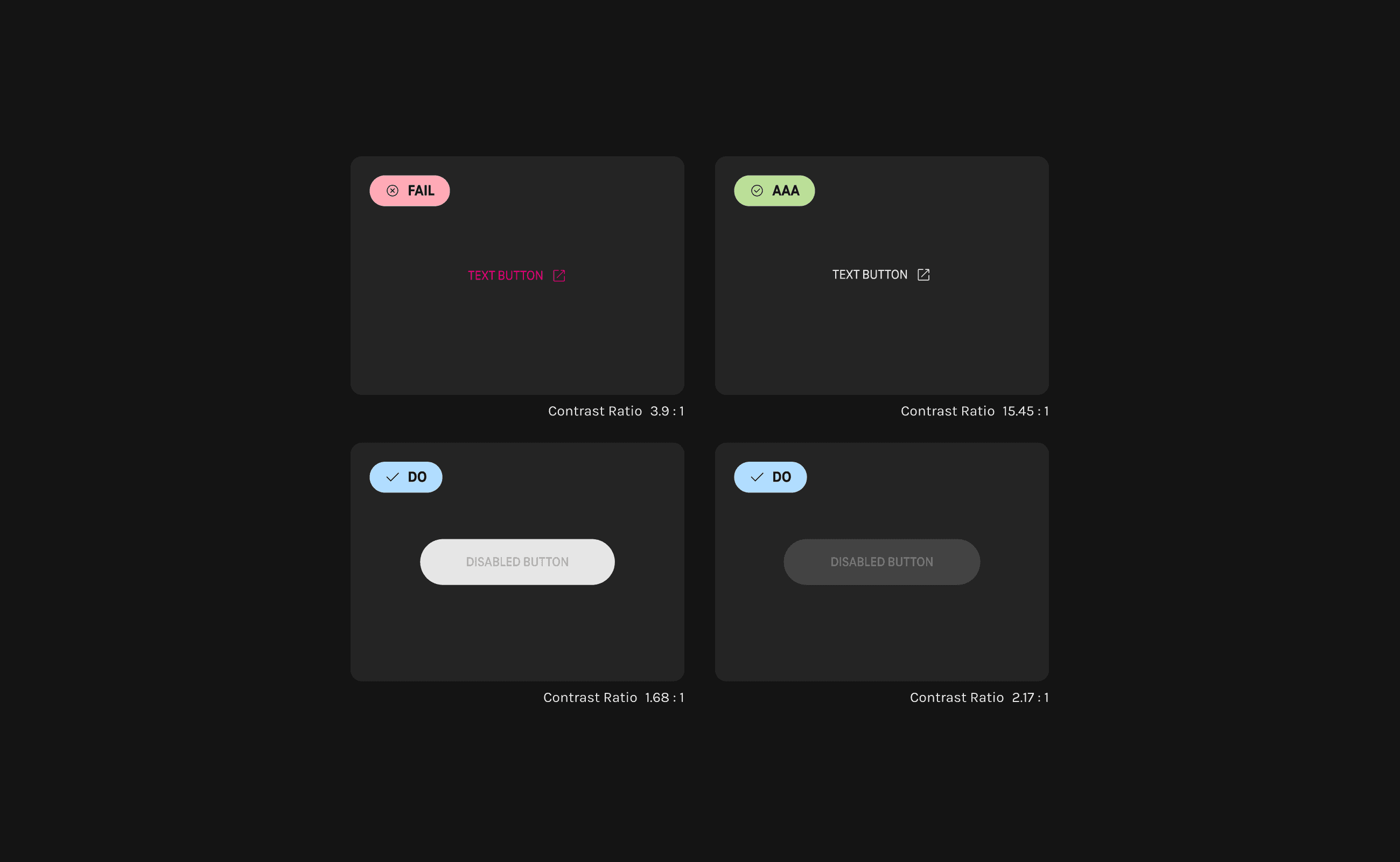
Accessibility is greatly affected by the contrast between elements. The higher the contrast ratio, the better the visibility. The use of Magenta in Dark Mode is limited for this reason, especially for small sized fonts. In the case of disabled buttons, the contrast ratio is ignored in order to indicate that the button is not accessible. In addition, I proposed to the team developing new colours by mixing black with existing colours and testing them on real devices. As a result, we redefined new colours that enhanced visibility and comfort in Dark Mode.

Project Gallery Image for 50% width of the screen #1
Project Gallery Image for 50% width of the screen #2

Building Smart Components: Light/Dark mode, Size, Type, State, etc. and considering ‘What if...?’ Cases and Going One Step Further

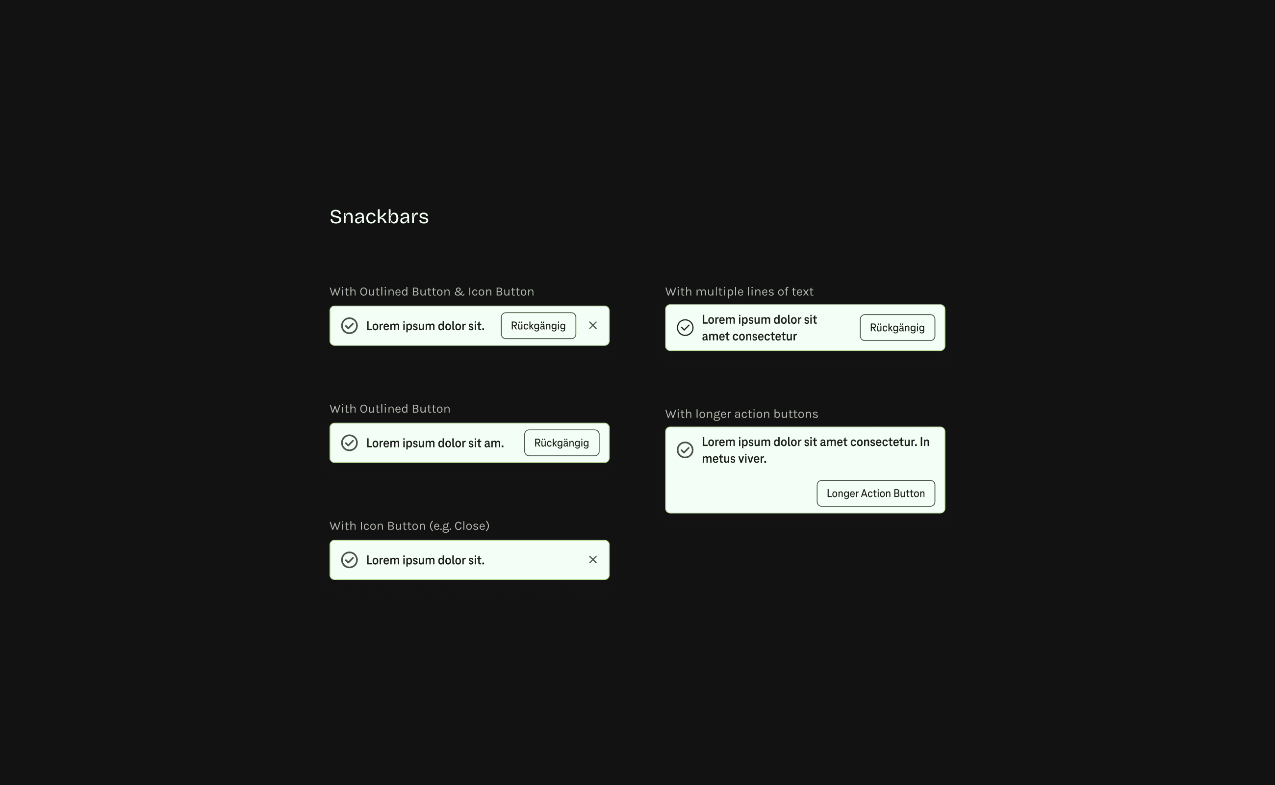
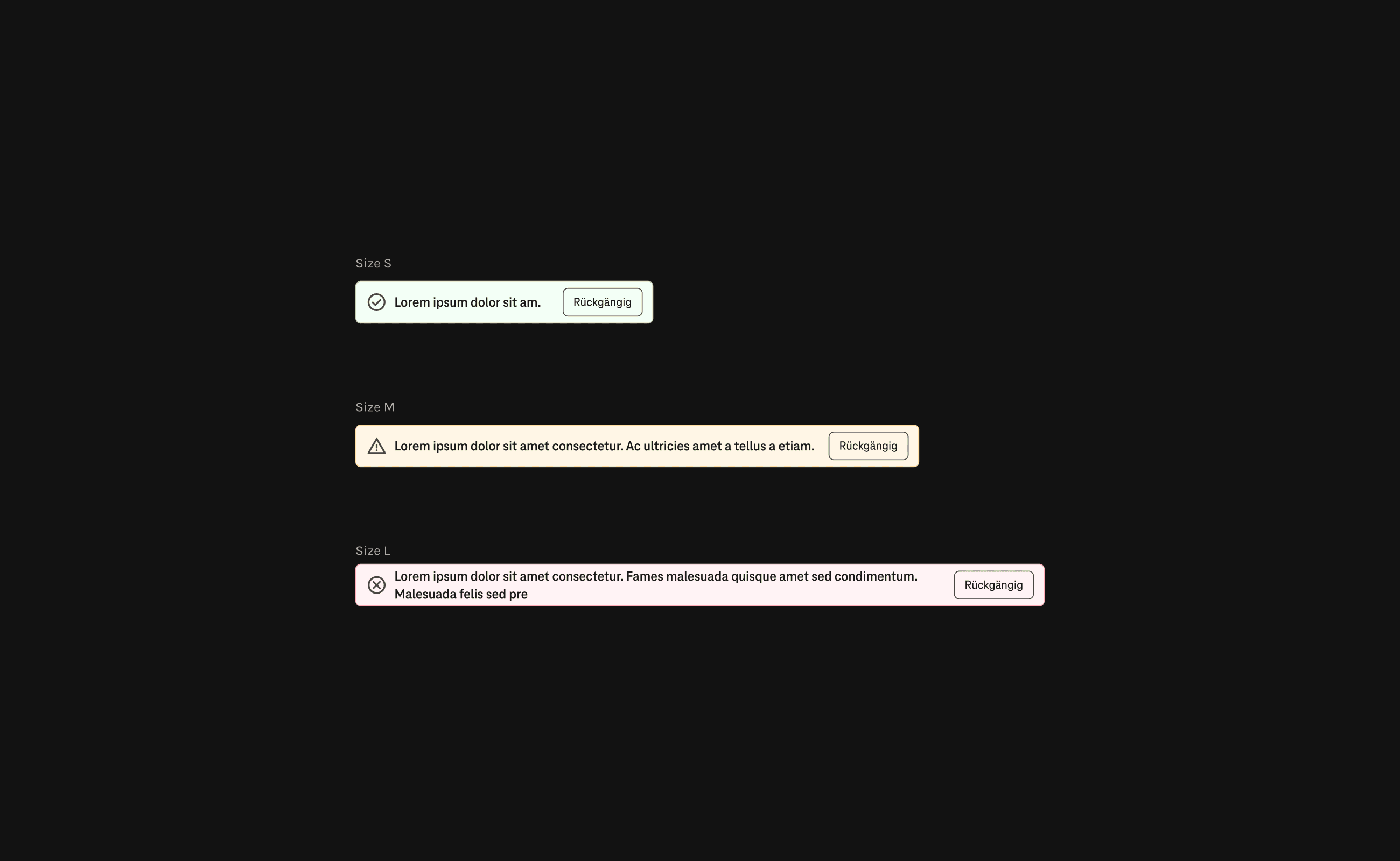
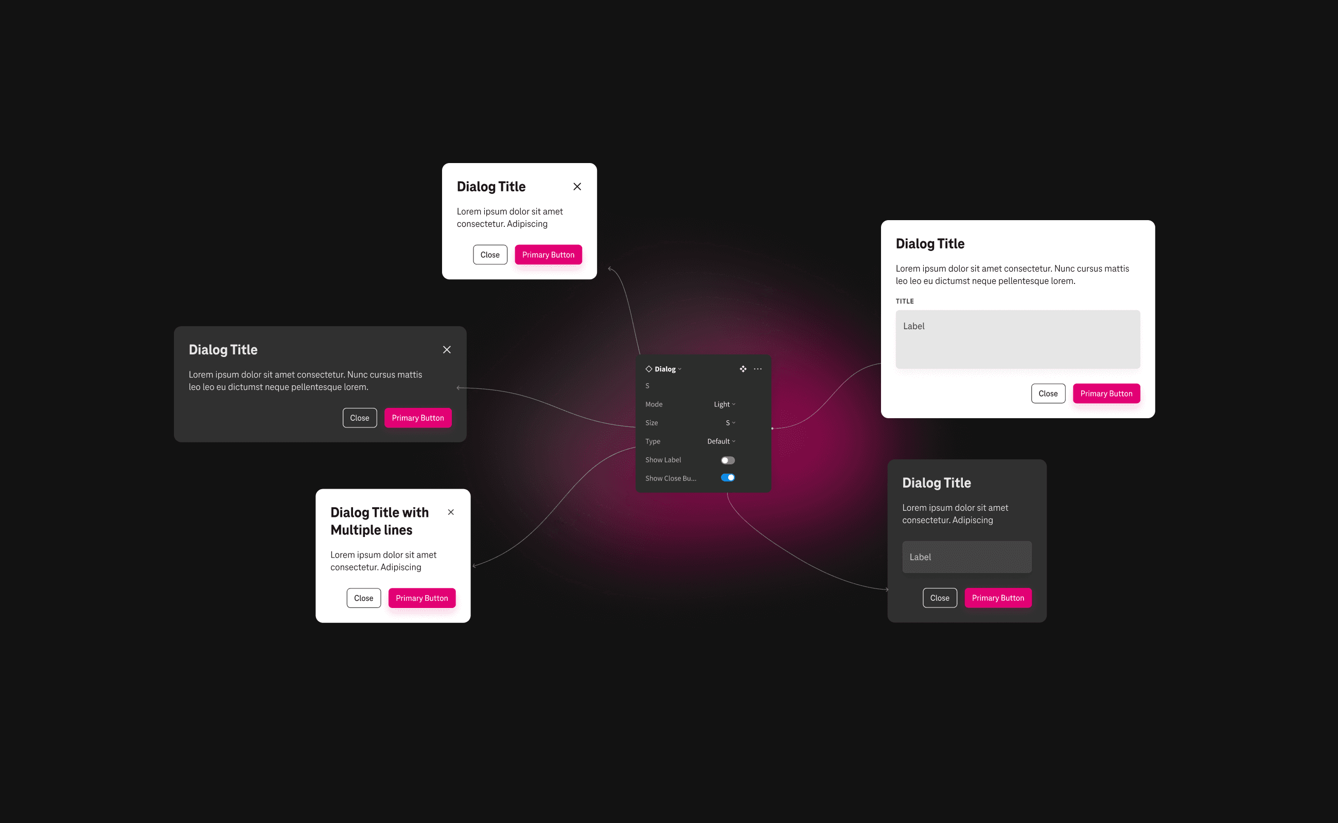
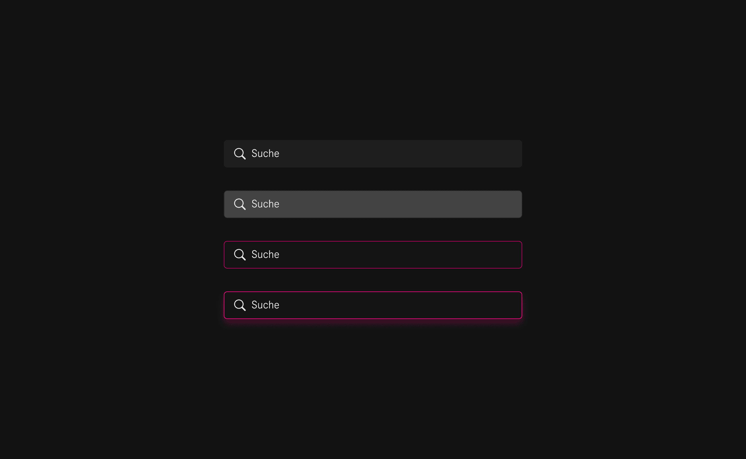
By utilising auto-layout and properties in the component set settings, we were able to completely reconstruct the component sets. This enables simple manipulation of each UI element in the future when designing an interface. Designing with the perfect length of body texts and ideal button sizes is a rather straightforward process. However, in order to offer a comprehensive and efficient guide, we needed to consider various ‘What if...?’ scenarios. For instance, I had to determine where to place an icon if the text was too long or where to position a button if its length exceeded the width limit of a mobile device. Taking into account these exceptional cases and understanding how developers work was an essential step in creating a meticulously thought-out design system guide.
Large Project Gallery Image #3
Large Project Gallery Image #4

Outcomes & Learnings

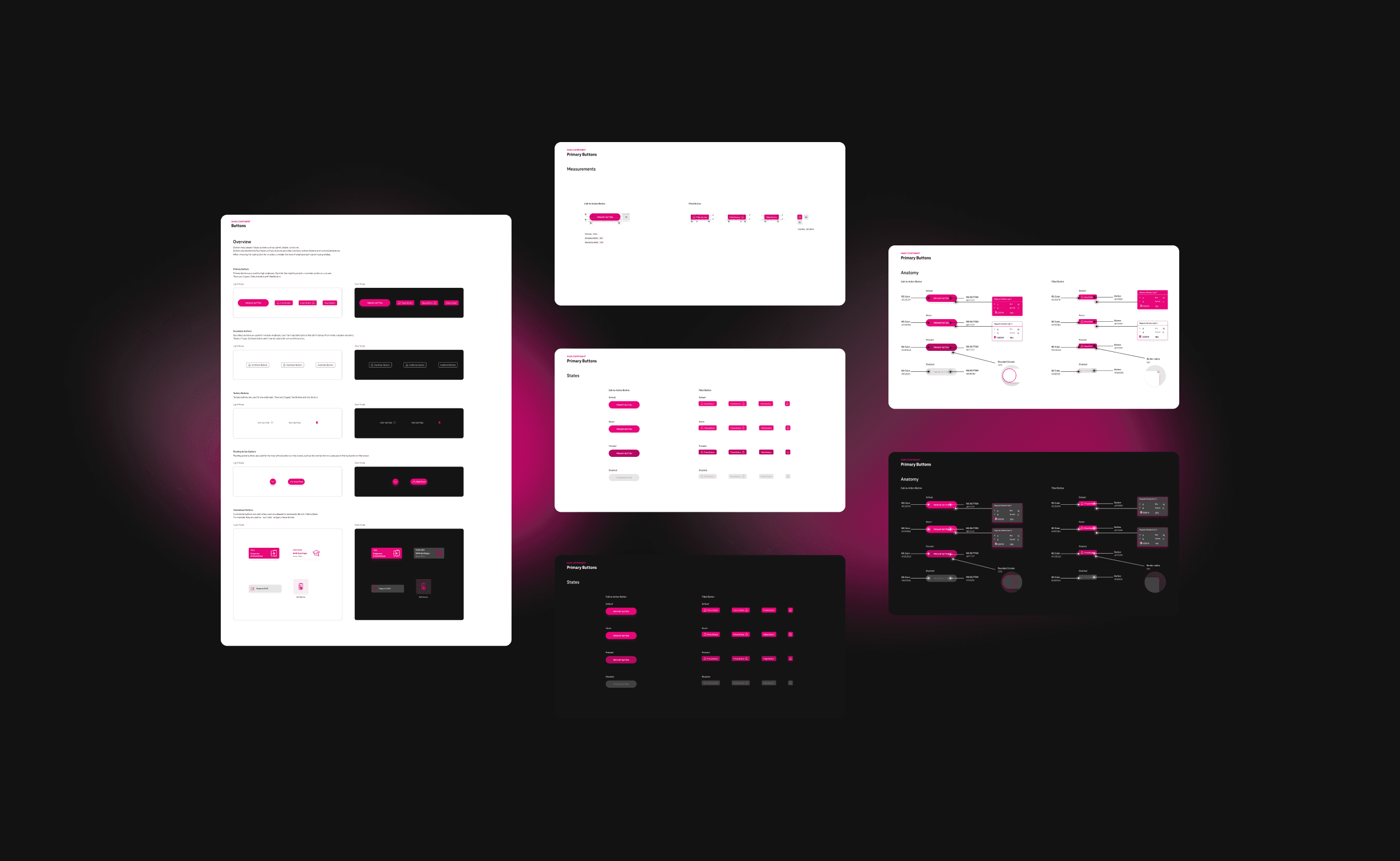
The purpose of the documentation was to provide developers with a detailed and coherent guide that would aid them in enhancing their existing user interface, while also facilitating its upkeep and evolution. The documentation was divided into four segments: Overview, Measurements, States (if required), and Anatomy. The long-awaited release of Design System 1.0 was met with great satisfaction from our client, and we anticipate that it will continue to evolve in the future. This project served as a valuable lesson on the significance of developing a design system with a strong emphasis on consistency, streamlined component sets, and effective communication with developers.

  • The image featured in the carousel #1
  • The image featured in the carousel #2
  • The image featured in the carousel #3
  • The image featured in the carousel #4
  • The image featured in the carousel #1
  • The image featured in the carousel #2
  • The image featured in the carousel #3
  • The image featured in the carousel #4
  • The image featured in the carousel #1
  • The image featured in the carousel #2
  • The image featured in the carousel #3
  • The image featured in the carousel #4

Thanks for scrolling down to the footer!

Let's start creating together

©2022-2024 Lomi Designs

Thanks for scrolling down to the footer!

Let's start creating together

©2022-2024 Lomi Designs

Thanks for scrolling down to the footer!

Let's start creating together

©2022-2024 Lomi Designs